 Using blueprint, the page is divided into 24 columns. In just a few minutes we whip out our three column layout for our webpage:
And here's our stylesheet that implements this layout:
Again, this is as easy to use as blueprint, but we've avoided making the mistake of putting presentation in our content.
Now let's say you have several different templates and you've been good about making nice semantic names for the different pages and none of the IDs are the same. But we want all of these pages to use the same layout. This is where your power to create abstraction comes in.
Using Sass you can define your own mixins that you can reuse! So you start by defining a three column mixin:
Now you can now simplify your layout declaration even further:
Using blueprint, the page is divided into 24 columns. In just a few minutes we whip out our three column layout for our webpage:
And here's our stylesheet that implements this layout:
Again, this is as easy to use as blueprint, but we've avoided making the mistake of putting presentation in our content.
Now let's say you have several different templates and you've been good about making nice semantic names for the different pages and none of the IDs are the same. But we want all of these pages to use the same layout. This is where your power to create abstraction comes in.
Using Sass you can define your own mixins that you can reuse! So you start by defining a three column mixin:
Now you can now simplify your layout declaration even further:
Tuesday, November 18, 2008
Creating a Reusable Three-column Layout using Compass
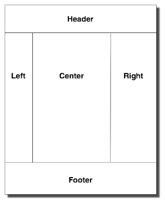
Let's pretend we want to build a three column layout like so:
 Using blueprint, the page is divided into 24 columns. In just a few minutes we whip out our three column layout for our webpage:
And here's our stylesheet that implements this layout:
Again, this is as easy to use as blueprint, but we've avoided making the mistake of putting presentation in our content.
Now let's say you have several different templates and you've been good about making nice semantic names for the different pages and none of the IDs are the same. But we want all of these pages to use the same layout. This is where your power to create abstraction comes in.
Using Sass you can define your own mixins that you can reuse! So you start by defining a three column mixin:
Now you can now simplify your layout declaration even further:
Using blueprint, the page is divided into 24 columns. In just a few minutes we whip out our three column layout for our webpage:
And here's our stylesheet that implements this layout:
Again, this is as easy to use as blueprint, but we've avoided making the mistake of putting presentation in our content.
Now let's say you have several different templates and you've been good about making nice semantic names for the different pages and none of the IDs are the same. But we want all of these pages to use the same layout. This is where your power to create abstraction comes in.
Using Sass you can define your own mixins that you can reuse! So you start by defining a three column mixin:
Now you can now simplify your layout declaration even further:
Subscribe to:
Post Comments (Atom)
No comments:
Post a Comment